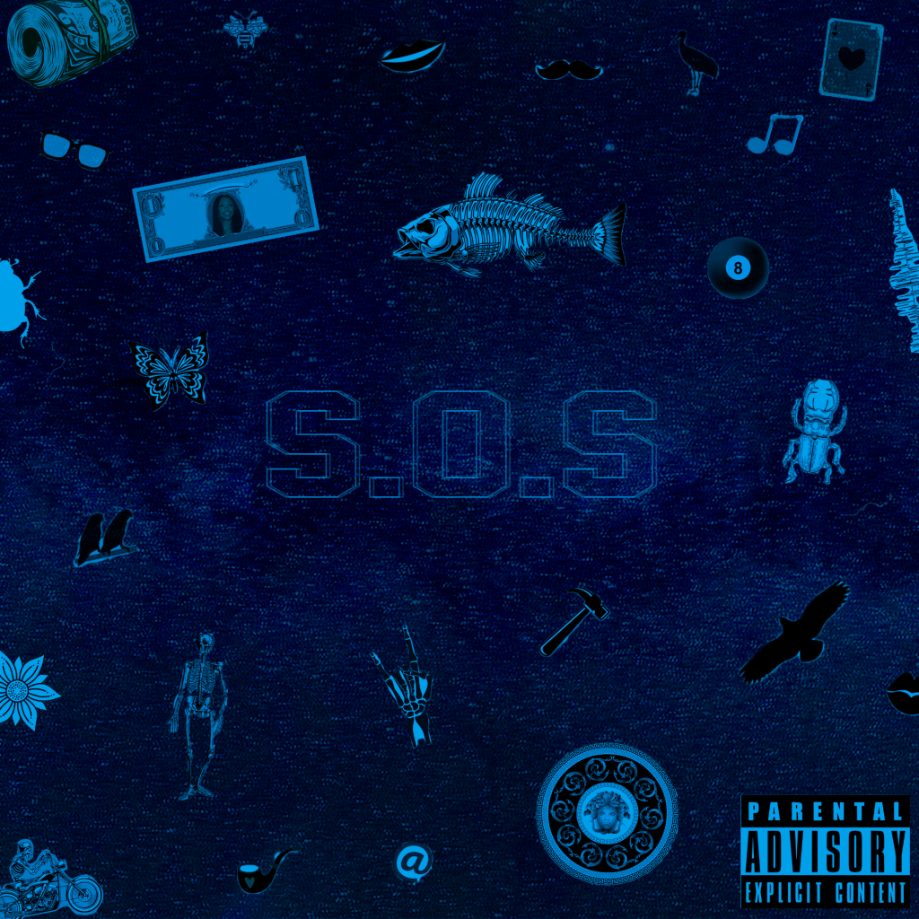
My inspiration was the singer SZA also known as Solána Imani Rowe. She was raised in maplewood New Jersey and she created an album S.O.S. I chose this album because I am going with a friend to her concert. So I wanted to recreate her album cover. Her Album is more of a soothing sound so I wanted to use a comfortable blue as the main color. I added a bunch of different emojis or icons to make the cover look full.
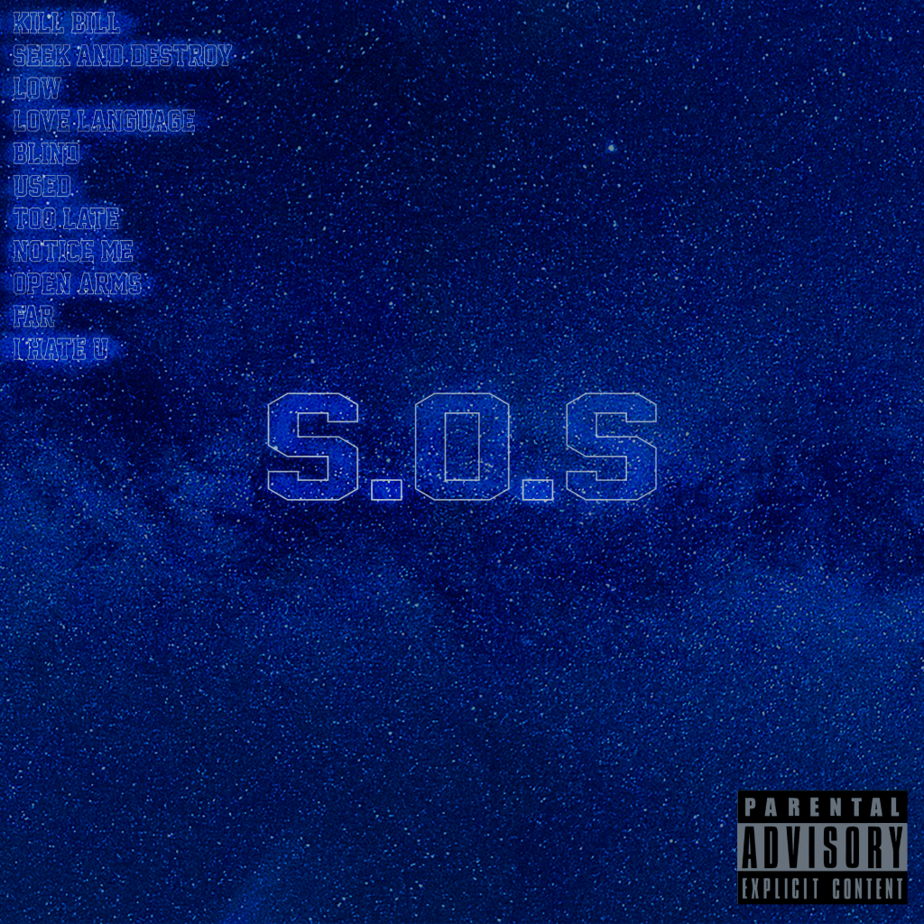
The adobe program I used the most was Photoshop and I used Adobe Illustrator for the font of the S.O.S. I used a great portion of the hue and saturation to really get the right blue I wanted. In CRAP contrast is displayed the most because of the amount of effects there are with the color of the album and the blur of the title. Alignment is also used mostly as there are a lot of emojis in the cover and they are spreaded out in certain ways to not leave much space around the edge of the cover but more space around the title. I used too much dodge on the front and the back of the cover to highlight the title and the name of the songs to make them pop out.
I wanted them to see an album of a bunch of meanings. The emojis show a lot of different meanings and as the album comes there are many meanings in the songs. I wanted a very full look as there were a lot of different things to look at. I wanted the viewers to see it as a blur so that they can see the big title but also have their eye move towards the other emojis in the front. I just want the message to have a whole different amount of meanings and they can have their own opinion on what the cover means.
I think the most successful parts of my artwork would be how well I put the blur on the cover. It tweeks with your eyes but doesn’t throw you off the cover. I really like how I made the emojis blend in with the colors of the background and how they are all a little bit different with shades. There are some with black and some with more blue color which makes everything balanced. I also like how the back of the cover is not doing too much and it is simple but pops out. The songs are highlighted to the point they are almost like led lights.
-Victor Larach