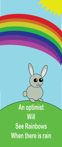
My artwork is a design of a bunny sitting on a hill with a rainbow in the sky. The title of my work is called a Bunny’s World. The shapes in my artwork are most obvious because I used different shapes. I played with how the shapes looked to make the different shapes in my work. I made this piece of art in Adobe Illustrator. I consistently used the selection tool and the shapes tool.
What inspired my artwork was the idea of rainbows. As a kid usually you would think of the rainbow as a symbol of joy and happiness. So I decided to put a bunny because bunnies are also considered a joy and cute animal. I tried to show the emotions of happiness, joy, and peace. My goal on this artwork is to make sure the viewer understands my message with peace and joy in the artwork. I think that my artwork displays joy and peace because of the bright colors, rainbow, bunny, and the sun. I enjoyed my art. I learned more about certain techniques on how to make certain objects with tools in illustrator. The picture is exactly how I imagined it would be because I added the details to show peace.
-Victor
COMPOSITION: I like the theme of the card and see where you were trying to go with it. The bunny is cute and the background was clever and helps add to the theme. However I believe the bunny could have used a little bit more detail or editing.
COLOR: I do not see anything wrong with the color. The color helps add to your theme and helps send a message of optimism and comfort. I also like how you included a sun and a rainbow instead of leaving the sky as just blue. This shows there is more going on in the card than just the rabbit.
ADVICE: My only advice is that I would have edited the rabbit a little bit more, maybe adding a little bit more detail to it. Like adding whiskers or giving it something to do.
The composition of this piece is good; Larach used a couple images across the image to get the viewer’s attention around the image. It looks like the rainbow is kissing the edge; you can see the point where all the colors originate right at the edge. Moreover, the Sun in the upper right hand corner uses a series of triangles to create the rays rather than a radial repeat pattern, which would appear cleaner.
The color choice within the image is excellent; Larach uses a bright sky and a large rainbow to create a colorful landscape. The balance of warm and cool colors creates an uplifting background. The rabbit provides some darker values to contrast the background’s abundant brighter values.
This image could do away with some negative space. I would add some more animals other than the rabbit. Larach could have added some birds to fill the upper portion of the image or some rodents to fill the lower portion.
Victor’s artwork was composed fairly well, but there are a few small issues in my opinion. First, it seems like the bunny is a bit off-center to the right, but that is not a big issue at all. Also, the bunny’s foot comes very close to some of the words, so some more spacing would help there. Everything else is spaced very well, though. The colors used in Victor’s artwork are vibrant and work very well. The rainbow, sun, sky, grass, and gray bunny complement each other perfectly. I also like the choice of the words being white because it stands out from the grass and is readable. My only true advice for Victor would be to change the font. It is too generic and does not complement the rest of the piece, so a different font is needed. Other than that, it is just a few spacing tweaks that need to be made. It is a very nice card overall.
COMPOSITION:
I love the composition, the layout works very well. The only issue is the rainbow attachment on the right is a little off. Other than that very small point, the layout is very optically pleasing.
COLOR:
I love the colors. Bright colors pop and when I see the colors used in this piece, it conjures happiness and excitement. This works perfectly for the idea behind the card
ADVICE:
The advice I give to you is based only on the text, I love everything else. The text doesn’t fit with the rest of the art. It looks like it was thrown on last minute, not as if it was originally designed with the text.